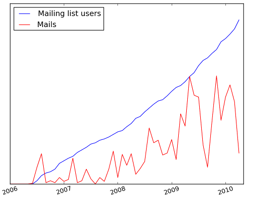
Here is a graph that shows the activity on the OTB users mailing list in the last 4 years. In blue, the number of registered users and in red, the number of mails per month.
The number of users is growing very regularly (and that’s good!), the activity is not so regular (the drop for the summer and Christmas holidays are clearly visible), but overall, the increase in activity is obvious.
